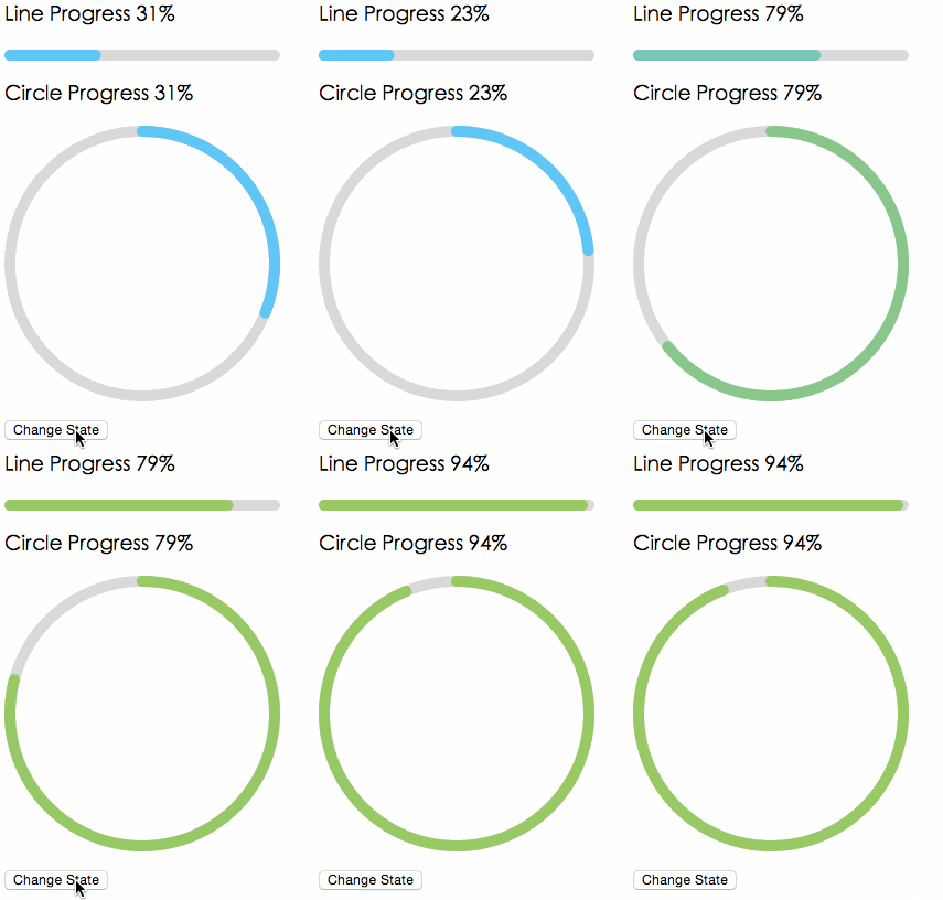
# react-percentage-circle **Repository Path**: mirrors_kennethjiang/react-percentage-circle ## Basic Information - **Project Name**: react-percentage-circle - **Description**: React Progress Bar - **Primary Language**: Unknown - **License**: Not specified - **Default Branch**: master - **Homepage**: None - **GVP Project**: No ## Statistics - **Stars**: 0 - **Forks**: 0 - **Created**: 2021-10-22 - **Last Updated**: 2026-01-04 ## Categories & Tags **Categories**: Uncategorized **Tags**: None ## README # rc-progress --- progress ui component for react [![NPM version][npm-image]][npm-url] [![SPM version](http://spmjs.io/badge/rc-progress)](http://spmjs.io/package/rc-progress) [![build status][travis-image]][travis-url] [![Test coverage][coveralls-image]][coveralls-url] [![gemnasium deps][gemnasium-image]][gemnasium-url] [![node version][node-image]][node-url] [![npm download][download-image]][download-url] [npm-image]: http://img.shields.io/npm/v/rc-progress.svg?style=flat-square [npm-url]: http://npmjs.org/package/rc-progress [travis-image]: https://img.shields.io/travis/react-component/progress.svg?style=flat-square [travis-url]: https://travis-ci.org/react-component/progress [coveralls-image]: https://img.shields.io/coveralls/react-component/progress.svg?style=flat-square [coveralls-url]: https://coveralls.io/r/react-component/progress?branch=master [gemnasium-image]: http://img.shields.io/gemnasium/react-component/progress.svg?style=flat-square [gemnasium-url]: https://gemnasium.com/react-component/progress [node-image]: https://img.shields.io/badge/node.js-%3E=_0.10-green.svg?style=flat-square [node-url]: http://nodejs.org/download/ [download-image]: https://img.shields.io/npm/dm/rc-progress.svg?style=flat-square [download-url]: https://npmjs.org/package/rc-progress ## Screenshots ## Feature * support ie9+,chrome,firefox,safari ### Keyboard ## install [![rc-progress](https://nodei.co/npm/rc-progress.png)](https://npmjs.org/package/rc-progress) ## Usage ```js var Line = require('rc-progress').Line; var Circle = require('rc-progress').Circle; var React = require('react'); React.render(
, container); ``` ## API ### props
name type default description
strokeWidth Number 1 Width of the stroke. Unit is percentage of SVG canvas size.
strokeColor String #3FC7FA Stroke color.
trailWidth Number 1 Width of the trail stroke. Unit is percentage of SVG canvas size. Trail is always centered relative to actual progress path. If trailWidth are not defined, it same as strokeWidth.
trailColor String #D9D9D9 Color for lighter trail stroke underneath the actual progress path.
## Development ``` npm install npm start ``` ## Example http://localhost:8000/examples/ online example: http://react-component.github.io/progress/ ## Test Case http://localhost:8000/tests/runner.html?coverage ## Coverage http://localhost:8000/node_modules/rc-server/node_modules/node-jscover/lib/front-end/jscoverage.html?w=http://localhost:8000/tests/runner.html?coverage ## License rc-progress is released under the MIT license.